Monday, December 6, 2010

I A.M. Cassandre!

Cassandre is considered one of the most influential artists not only from the art deco movement, but as one of graphic designs most influential. Cassandre was trained in Paris as a painter, but made a name for him self in creating posters. One of his first posters called “The wood Cutter” won the “Exposition Internationale des Arts Décoratifs et Industriels Modernes”.

It also won the competition for most manly Poster


It also helped define the look of the Art Deco movement, with Cassandre being heavily influenced by Picasso and the cubist style, this gave the work a somewhat abstract simple motif. Soon everyone was all “I totally want a Cassandre poster” and Cassandre created some extremely iconic works during this period.


Note the simple shapes, and use of gradient created through the use of airbrush. Another motif present in this poster is it’s larger than life grandeur, art deco often glorified man made object as much as it could, making them part of the landscape.
Another of Cassandre’s contributions to graphic design was his use of typography, often creating his own fonts


But he also explored use of type as part of the image, which is considered one of his greater contributions

I assume it's about the dangers of electrical cords being jammed in your wrists.

When WWII struck, Cassandre was drafted and though he returned safely he had lost his firm. He eventually committed suicide with a letter of rejection found near the scene.

I’m going to be (Desk) Top Dog!

Deciding I wanted be a sheep and do the magazine everyone else in class has (probably) done, let’s do the legendary (The only art magazine I’ve got my hands on) Desktop Magazine! Desktop covers a wide range of topics that will interest those in the graphic design industry, as well as those who simply enjoy that general community or atmosphere. They also make articles that will generally interest anyone who is up for a read.

The mags main topics of interest for the graphic designer would be the articles on up and comers in the community, which is always good for inspiration as well as spotting up and coming trends. Speaking of trends, this magazine also likes to point out trends within the industry currently going on such as the current type boom

They also write articles on things that graphic artist should definitely be informed about, such as computer format changes, new programs and how to use them (something graphic designers have to keep up with) and supply competitions that allow for jobs and prizes to designers which would be appreciated by the freelancer. So it’s basically the newspaper of designer town.

As seen here, the newest method of creating magazine covers is to create its design, print it out, have someone hold it and then take a photo of it. Brilliant!

I Was Drawn In!

The Art/Design blog “Drawn” is one I’ve followed for quite a long time, since I was but a wee lad’ possibly. Their blog has talked about all the areas of the design world, from typography to animation. They’re current as well often talking about what’s happing in the artistic world (I seem to remember at one point they were talking about a possible change in copyright laws that would bone all the creatives out there, and probably kill babies too!). Recently they’ve been making another layout to their site, which is bad because change is bad and I don’t like it :(

Some of the artists I’ve found over the years from Drawn were
Guy Burwell
Robert Valley
McBess
Scott K.McDonald

A Novel Idea!

Probably one of the more well known and powerful design/illustration groups out there (In Australia), they have helped with quite a few more well known ad campaigns and rumour has it their influence on the government runs deep (Dun dun dun!)


Not too much can be said about them that can’t be found on their site, unless I were to be negative…

(James was found in a ditch a week later)


More work that makes you feel inadequate in comparison can be found at http://drawingbook.com.au/

Sunday, December 5, 2010

A Comical Adventure!

Scott Mccloud likes comics. Not just like, but like likes comics. He loves comics so much he decided to write a book on comics. But being the intelligent guy he is, he realised it’d be way more awesome write about comics, in comic form. So here we have “understanding comics”


Now this book isn’t a how-to book, in fact it doesn’t even scrape that topic, the entirety of it is dedicated to theories on why comics are a great (and often over-looked) artistic medium. Now comic theory is hugely complicated, it’s something that kept geniuses the world over up at night, but Scott tackles this in 9 different chapters
  • 1. Placing an appropriate definition on comics
  • 2. The Visual style of comics
  • 3. Comic’s use of closure
  • 4. How time is presented within Comics
  • 5. How comics expresses emotion in its panels
  • 6. How comics relies heavily not just on Images, but the written word as well
  • 7. What comics has in common with other artistic mediums
  • 8. Comics use of colour
  • 9. What all this means (retrospective chapter)

While I could talk about the entire book, and comics, since this is a design blog I will talk about the chapter that is most relevant to all art these days.


What do you see? If you see a face, you are wrong. This is an image of a circle, two dots and a line. And yet, anyone you may ask will come up with the same answer. Why is this? Do we all have vision problems? Did our ancestors look like this? Well Scott came up with a very reasonable answer

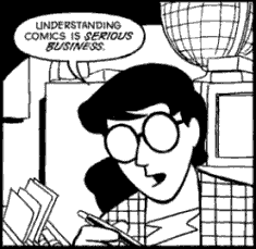
He has all the answers…. Smug bastard

His belief is that we see our self image as extremely simplified versions of ourselves, something along the lines of a simple minimalistic cartoon. Thus when we see a cartoon, we can see a person. Because of this we have a greater affinity for cartoon characters as we can more easily place ourselves in their shoes. Pure magic!

Scott wrote this book the intention of other have differing opinions, so I’ll throw my two cents in. I think his theory is close, but not quite right. For example, what do you see in this image?


A dog, correct? But based on Scott’s theory, that shouldn’t be, as we don’t see ourselves as simplified dogs, and yet we know that this image is of a dog. I believe that we simply are intelligent enough to know what an image is meant to be of. This may be because we’ve been drawing such things for thousands of years, it may be because we rule as a species (take that all other animals!)


However, because of the simplified nature of the characters, they appeal to us because they are vastly different from what’s around us. Thus we have a greater connection to them.

But regardless, this book is a great read, and if you enjoy comics it’s interesting to gain further insight into them, and into the aspects of them that you would have never thought about before hand.

Thursday, December 2, 2010

TO FREEEEDOM!

A lot of people have made a list of what their favourite album art pieces are, I’m not doing that. I only need one album cover. A lot of people seem to list this as one of the greatest album covers of all time:

Whoops! Sorry, I didn't mean to post a blank image. I'm sure I have the cover somewhere...
These people clearly have no taste. This album cover is not nearly naked, sweaty and manly enough. There can only be one great album cover and that is

Yeah you might be able to do a jump on your motorcycle, but can you do a jump one your motorcycle whilst having sex with it?
Besides just looking like an effectively awesome album cover, it perfectly illustrates the title track of the album, whilst also capturing a cheesy over the top feel that the album has throughout its music. Just kidding, it works simply because it looks so bad ass.

Wednesday, November 24, 2010

Beauty in the Darkest of Places

There is particular type of design that has been tickling my fancy lately. I call it ugly design. Not bad design. Just ugly. Like your mum. The goal of ugly design is to appear amateurish and poor, but they succeed in what they need to do. I've noticed a boom in them as they are popular in the internet culture. It's just possible though that these basement dwellers have no artistic skills, but have some decent design sense.


 Smile!


Doesn’t this guy just bring a smile to your face? Doesn’t the face have a sort of cock sure look to it? If you answered yes, then it succeeds in what it was meant to do. And with the troll face, has come a flood of others

 Forever Alone
Rage Guy


These are hugely popular, and have become an internet fad. I think the ugly design plays to this, it allows anyone to join. You don’t have to be artistically talented, as the drawings are already ugly, but your final product will always have that same, repetitive, killer punch line.


However, before you start feeling good about your unfortunate looks, there is a limit to ugly design…. A limit that should never be crossed.

OH GOD NO!