Let’s get this thing out of the way! I’ll review two animations in one post! Insanity you say!? I THINK NOT!
Crater Face from Skyler Page on Vimeo.
This animation works well visually because of it’s somewhat sketchy and cartoony style, which allows it room for visual gags that wouldn’t be quite as acceptable in a more realistic or formal style. Being sketchy would have also allowed for easier animation, but also gave it room to change the character designs a bit (like when the space man tears his suit off (HOT!), he becomes more realistic, this would have stood out like a sore thumb on a cartoon such as the Simpsons etc.
Bad Hair from nelson boles on Vimeo.
Speaking of sketchy styles, they don’t come any more sketchy than this baby here. I think the style here is what really helps give it its punch. The animator probably intended to add more and it probably could be a bit more fluid, but I think this is a testament to how, even with a cheap quick style a story or joke can shine through. No need to go all out and big budget 100% of the time. So get lazy people!
Monday, December 6, 2010
Nothing but a Blip on the Screen!
 |
| An image from Sword and Sorcery from the SuperBrothers |
In recent years there has been a boom in pixel art, with new video games still being made in this style, music videos and just general art, it’s becoming a big thing. But scientists are stumped as to why they’ve had a resurgence, but I have a theory!
 |
| Think you’re so clever don’t you! |
They long for the old. We all do, hell the Victorian art movement was based solely on motifs of the old. Nostalgia is a strong feeling that make us love even the most stupid things. But this isn’t to say this art is bad, as the image at the top now shows, it’s moved from just being a limitation to a style all its own, that’s almost abstract and cubist. Wether or not the art remains popular needs to be seen
A Warped Situation!

A book cover for the Superhero Plastic man, whose power is to warp and distort himself. So now he’s the book cover! Get it? Get it? It also works well as not only is it a distinctive book cover, it’s also eye catching, using up the entire book for the character makes him far more noticeable than any normal book cover! Clever little guys.
There's also the use of the speech bubble for the title and his belt as guide lines for the rest of the text, which makes the image see more natural. Yep.
The Art of Normal!
While bands often try to make themselves appear as “cool” as possible
I’ve noticed another visual trend in bands that often affects how they interact with others, perform and how mainstream they often try to be. It’s the “normal” look. Often distinguishable because there will almost always be someone wearing a plaid shirt. It was this look that has defined not only quite a few bands (pixies, Pavement, The fall) but the one of the characteristics of the grunge movement (Mudhoney, Nirvana) was this look.
 |
| Definition of cool, Baby! |
 |
| We have multi-million dollar record deals and all I could afford was this shitty plaid shirt and jeans! |
A Killer Opening!
Not much I can say that won’t become plainly obvious when you simply watch the video. Here we have the opening for the T.V show Dexter, about a murderous murderer who murders other murderous murderers and then goes home to watch “Murder she Wrote” (probably). So given the plot of the show, we watch Dexter doing his usual thang which is just every day morning rituals but given the visual twist of making each one appear more sinister than they really are.
A Murder Mystery!

A Montage of the Moments!
 |
| Victorian |
 |
| This one obviously used Mexican art influences as well |
 |
| Arts and Crafts |

 |
| Art Nouveau |

 |
| Early Modern |

 |
| Art Deco |

 |
| American Kitsch |

 |
| Late Modern |

 |
| Swiss International |

 |
| Psychedelia |

 |
| Contemporary |

 |
| Post Modern |
 |
| Digital |
I A.M. Cassandre!
Cassandre is considered one of the most influential artists not only from the art deco movement, but as one of graphic designs most influential. Cassandre was trained in Paris as a painter, but made a name for him self in creating posters. One of his first posters called “The wood Cutter” won the “Exposition Internationale des Arts Décoratifs et Industriels Modernes”.
It also helped define the look of the Art Deco movement, with Cassandre being heavily influenced by Picasso and the cubist style, this gave the work a somewhat abstract simple motif. Soon everyone was all “I totally want a Cassandre poster” and Cassandre created some extremely iconic works during this period.

Note the simple shapes, and use of gradient created through the use of airbrush. Another motif present in this poster is it’s larger than life grandeur, art deco often glorified man made object as much as it could, making them part of the landscape.
Another of Cassandre’s contributions to graphic design was his use of typography, often creating his own fonts

But he also explored use of type as part of the image, which is considered one of his greater contributions
When WWII struck, Cassandre was drafted and though he returned safely he had lost his firm. He eventually committed suicide with a letter of rejection found near the scene.
 |
| It also won the competition for most manly Poster |
It also helped define the look of the Art Deco movement, with Cassandre being heavily influenced by Picasso and the cubist style, this gave the work a somewhat abstract simple motif. Soon everyone was all “I totally want a Cassandre poster” and Cassandre created some extremely iconic works during this period.

Note the simple shapes, and use of gradient created through the use of airbrush. Another motif present in this poster is it’s larger than life grandeur, art deco often glorified man made object as much as it could, making them part of the landscape.
Another of Cassandre’s contributions to graphic design was his use of typography, often creating his own fonts
But he also explored use of type as part of the image, which is considered one of his greater contributions
 |
| I assume it's about the dangers of electrical cords being jammed in your wrists. |
When WWII struck, Cassandre was drafted and though he returned safely he had lost his firm. He eventually committed suicide with a letter of rejection found near the scene.
I’m going to be (Desk) Top Dog!

The mags main topics of interest for the graphic designer would be the articles on up and comers in the community, which is always good for inspiration as well as spotting up and coming trends. Speaking of trends, this magazine also likes to point out trends within the industry currently going on such as the current type boom
They also write articles on things that graphic artist should definitely be informed about, such as computer format changes, new programs and how to use them (something graphic designers have to keep up with) and supply competitions that allow for jobs and prizes to designers which would be appreciated by the freelancer. So it’s basically the newspaper of designer town.
 |
| As seen here, the newest method of creating magazine covers is to create its design, print it out, have someone hold it and then take a photo of it. Brilliant! |
I Was Drawn In!

Some of the artists I’ve found over the years from Drawn were
Guy Burwell
Robert Valley
McBess
Scott K.McDonald
A Novel Idea!

Not too much can be said about them that can’t be found on their site, unless I were to be negative…
(James was found in a ditch a week later)


More work that makes you feel inadequate in comparison can be found at http://drawingbook.com.au/
Sunday, December 5, 2010
A Comical Adventure!
Scott Mccloud likes comics. Not just like, but like likes comics. He loves comics so much he decided to write a book on comics. But being the intelligent guy he is, he realised it’d be way more awesome write about comics, in comic form. So here we have “understanding comics”

Now this book isn’t a how-to book, in fact it doesn’t even scrape that topic, the entirety of it is dedicated to theories on why comics are a great (and often over-looked) artistic medium. Now comic theory is hugely complicated, it’s something that kept geniuses the world over up at night, but Scott tackles this in 9 different chapters
While I could talk about the entire book, and comics, since this is a design blog I will talk about the chapter that is most relevant to all art these days.

What do you see? If you see a face, you are wrong. This is an image of a circle, two dots and a line. And yet, anyone you may ask will come up with the same answer. Why is this? Do we all have vision problems? Did our ancestors look like this? Well Scott came up with a very reasonable answer
His belief is that we see our self image as extremely simplified versions of ourselves, something along the lines of a simple minimalistic cartoon. Thus when we see a cartoon, we can see a person. Because of this we have a greater affinity for cartoon characters as we can more easily place ourselves in their shoes. Pure magic!
Scott wrote this book the intention of other have differing opinions, so I’ll throw my two cents in. I think his theory is close, but not quite right. For example, what do you see in this image?

A dog, correct? But based on Scott’s theory, that shouldn’t be, as we don’t see ourselves as simplified dogs, and yet we know that this image is of a dog. I believe that we simply are intelligent enough to know what an image is meant to be of. This may be because we’ve been drawing such things for thousands of years, it may be because we rule as a species (take that all other animals!)

However, because of the simplified nature of the characters, they appeal to us because they are vastly different from what’s around us. Thus we have a greater connection to them.
But regardless, this book is a great read, and if you enjoy comics it’s interesting to gain further insight into them, and into the aspects of them that you would have never thought about before hand.
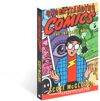
Now this book isn’t a how-to book, in fact it doesn’t even scrape that topic, the entirety of it is dedicated to theories on why comics are a great (and often over-looked) artistic medium. Now comic theory is hugely complicated, it’s something that kept geniuses the world over up at night, but Scott tackles this in 9 different chapters
- 1. Placing an appropriate definition on comics
- 2. The Visual style of comics
- 3. Comic’s use of closure
- 4. How time is presented within Comics
- 5. How comics expresses emotion in its panels
- 6. How comics relies heavily not just on Images, but the written word as well
- 7. What comics has in common with other artistic mediums
- 8. Comics use of colour
- 9. What all this means (retrospective chapter)
While I could talk about the entire book, and comics, since this is a design blog I will talk about the chapter that is most relevant to all art these days.
What do you see? If you see a face, you are wrong. This is an image of a circle, two dots and a line. And yet, anyone you may ask will come up with the same answer. Why is this? Do we all have vision problems? Did our ancestors look like this? Well Scott came up with a very reasonable answer
 |
| He has all the answers…. Smug bastard |
His belief is that we see our self image as extremely simplified versions of ourselves, something along the lines of a simple minimalistic cartoon. Thus when we see a cartoon, we can see a person. Because of this we have a greater affinity for cartoon characters as we can more easily place ourselves in their shoes. Pure magic!
Scott wrote this book the intention of other have differing opinions, so I’ll throw my two cents in. I think his theory is close, but not quite right. For example, what do you see in this image?

A dog, correct? But based on Scott’s theory, that shouldn’t be, as we don’t see ourselves as simplified dogs, and yet we know that this image is of a dog. I believe that we simply are intelligent enough to know what an image is meant to be of. This may be because we’ve been drawing such things for thousands of years, it may be because we rule as a species (take that all other animals!)

However, because of the simplified nature of the characters, they appeal to us because they are vastly different from what’s around us. Thus we have a greater connection to them.
But regardless, this book is a great read, and if you enjoy comics it’s interesting to gain further insight into them, and into the aspects of them that you would have never thought about before hand.
Thursday, December 2, 2010
TO FREEEEDOM!
A lot of people have made a list of what their favourite album art pieces are, I’m not doing that. I only need one album cover. A lot of people seem to list this as one of the greatest album covers of all time:
These people clearly have no taste. This album cover is not nearly naked, sweaty and manly enough. There can only be one great album cover and that is
Besides just looking like an effectively awesome album cover, it perfectly illustrates the title track of the album, whilst also capturing a cheesy over the top feel that the album has throughout its music. Just kidding, it works simply because it looks so bad ass.
 |
| Whoops! Sorry, I didn't mean to post a blank image. I'm sure I have the cover somewhere... |
 |
| Yeah you might be able to do a jump on your motorcycle, but can you do a jump one your motorcycle whilst having sex with it? |
Subscribe to:
Comments (Atom)