Let’s get this thing out of the way! I’ll review two animations in one post! Insanity you say!? I THINK NOT!
Crater Face from Skyler Page on Vimeo.
This animation works well visually because of it’s somewhat sketchy and cartoony style, which allows it room for visual gags that wouldn’t be quite as acceptable in a more realistic or formal style. Being sketchy would have also allowed for easier animation, but also gave it room to change the character designs a bit (like when the space man tears his suit off (HOT!), he becomes more realistic, this would have stood out like a sore thumb on a cartoon such as the Simpsons etc.
Bad Hair from nelson boles on Vimeo.
Speaking of sketchy styles, they don’t come any more sketchy than this baby here. I think the style here is what really helps give it its punch. The animator probably intended to add more and it probably could be a bit more fluid, but I think this is a testament to how, even with a cheap quick style a story or joke can shine through. No need to go all out and big budget 100% of the time. So get lazy people!
A Blog About Stuff
It's Not a Blog About Ping-Pong
Monday, December 6, 2010
Nothing but a Blip on the Screen!
 |
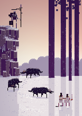
| An image from Sword and Sorcery from the SuperBrothers |
In recent years there has been a boom in pixel art, with new video games still being made in this style, music videos and just general art, it’s becoming a big thing. But scientists are stumped as to why they’ve had a resurgence, but I have a theory!
| Think you’re so clever don’t you! |
They long for the old. We all do, hell the Victorian art movement was based solely on motifs of the old. Nostalgia is a strong feeling that make us love even the most stupid things. But this isn’t to say this art is bad, as the image at the top now shows, it’s moved from just being a limitation to a style all its own, that’s almost abstract and cubist. Wether or not the art remains popular needs to be seen
A Warped Situation!
A book cover for the Superhero Plastic man, whose power is to warp and distort himself. So now he’s the book cover! Get it? Get it? It also works well as not only is it a distinctive book cover, it’s also eye catching, using up the entire book for the character makes him far more noticeable than any normal book cover! Clever little guys.
There's also the use of the speech bubble for the title and his belt as guide lines for the rest of the text, which makes the image see more natural. Yep.
The Art of Normal!
While bands often try to make themselves appear as “cool” as possible
I’ve noticed another visual trend in bands that often affects how they interact with others, perform and how mainstream they often try to be. It’s the “normal” look. Often distinguishable because there will almost always be someone wearing a plaid shirt. It was this look that has defined not only quite a few bands (pixies, Pavement, The fall) but the one of the characteristics of the grunge movement (Mudhoney, Nirvana) was this look.
| Definition of cool, Baby! |
 |
| We have multi-million dollar record deals and all I could afford was this shitty plaid shirt and jeans! |
A Killer Opening!
Not much I can say that won’t become plainly obvious when you simply watch the video. Here we have the opening for the T.V show Dexter, about a murderous murderer who murders other murderous murderers and then goes home to watch “Murder she Wrote” (probably). So given the plot of the show, we watch Dexter doing his usual thang which is just every day morning rituals but given the visual twist of making each one appear more sinister than they really are.
A Murder Mystery!
Since I made a post about comics not too long ago, let’s take a look at one Called “His Face all Red” by Emily Carroll. Visually the comic has an almost hand coloured feel to it, with random ink blots and textures and with hand written text, adding to the feel the comic goes for. I won’t say much about the story, but you should put on your pull ups as this is a scary story (Ooooooh!), which is really helped by it’s format (web comic). This story scrolls down for large degrees, and could probably do the entire story in a single webpage, but the story is spread across several, to build tension from the last page. Another nifty thing about the use of medium is that the comic can have panel layouts in it that no paper published comic could, so take a look.
A Montage of the Moments!
Subscribe to:
Comments (Atom)


